Unlocking the Potential of Your Space Through Color
The quest to define a personal or professional space often begins with an overwhelming array of choices, none more impactful and yet more daunting than color selection. Many individuals find themselves paralyzed by the sheer volume of hues, shades, and tones, leading to decisions based on fleeting trends or safe, uninspiring neutral palettes. This hesitation frequently results in environments lacking character, failing to evoke desired emotions, and not reflecting the true potential of the space. The problem isn't a lack of options, but a lack of clarity and confidence in informed color choices.
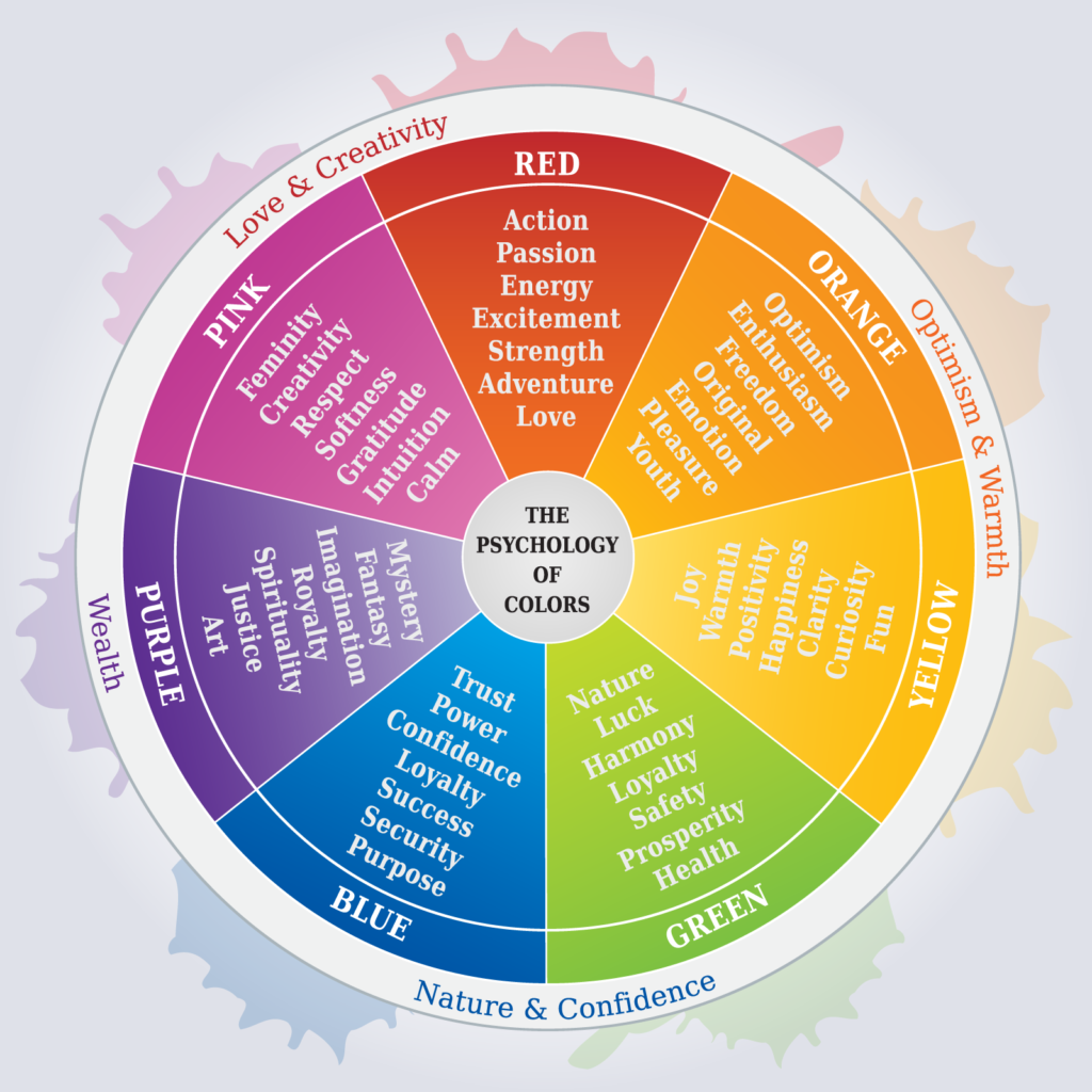
Beyond aesthetics, color profoundly influences our psychology, mood, and productivity. A vibrant workspace stimulates creativity; a serene bedroom promotes rest. Without understanding color psychology, people often choose schemes working against intentions. A bright red suits a dining area but could hinder focus in a study. The subtle interplay of light, texture, and elements complicates this, making a seemingly simple decision surprisingly complex and prone to missteps.
A significant hurdle is the inability to accurately visualize how a chosen color truly appears within a specific environment. A small paint swatch rarely conveys the full impact under varying light conditions. This disconnect between expectation and reality leads to costly redecorations, fostering frustration. The challenge intensifies when considering how different colors interact with existing furniture, flooring, and architectural features, demanding a more sophisticated approach.
The cumulative effect of these challenges often creates a space that feels unfinished or 'off.' Instead of serving as comfort or inspiration, the environment becomes a reminder of missed design opportunities. This problem impacts well-being, motivation, and daily interaction. A poorly colored room can drain energy, diminish focus, and contribute to stress, underscoring the critical need for a structured, insightful approach to color selection. With Erbeder, we believe that informed color decisions are within everyone's reach.
Common Pitfalls in Color Selection
-
Limited Understanding of Color Psychology: Unawareness of how colors influence mood and perception leads to choices based purely on personal liking, creating spaces incongruous with their intended function.
-
Inadequate Visualization: Relying on small samples or online images fails to account for how lighting, room size, and elements alter color. Inability to 'see' the finished product in context causes regret.
-
Ignoring Existing Elements: Overlooking fixed elements (flooring, cabinetry) when selecting new colors leads to clashes. A new color must harmonize with existing features for a cohesive environment.
Strategic Solutions for Harmonious Hues
1. Harness the Power of Color Psychology
Understanding color psychology is key. Hues carry associations; blues/greens evoke tranquility for bedrooms, reds/oranges suggest energy for dining areas. Aligning color with function and desired atmosphere creates environments supporting your goals, transforming decoration into a powerful life-enhancing tool.
To implement, define your space's purpose and desired feelings. Research color families' psychological associations. Consider saturation/brightness; a deep navy differs from a light sky blue. Experiment with accent colors for a 'pop' without overwhelming. Thoughtful color psychology ensures your space is visually appealing, functional, and emotionally resonant.
2. Leverage Advanced 3D Visualization Tools
Modern design offers revolutionary tools. 3D visualization software, like platforms from Erbeder, lets you digitally 'paint' your space. See how colors interact with dimensions, furniture, and lighting before commitment. This technology provides an unparalleled preview, showing the exact impact of a color scheme, mitigating risk and ensuring satisfaction.
Embracing 3D visualization empowers free experimentation with bold or subtle shifts, understanding their full effect without multiple samples or costly reworks. Explore different lighting scenarios—daylight, evening, artificial—to grasp how colors transform. This saves time and money, boosting confidence, turning abstract ideas into tangible, visual realities.
3. Adopt an Iterative and Sample-Based Approach
Even with advanced visualization, physical verification is crucial. Create a mood board with your color palette, fabric swatches, and decor images. After narrowing, invest in actual paint samples. Paint large swatches on walls or boards, moving them. Observe samples at different times and lighting. This confirms digital visualizations and reveals true color behavior.
Consider phased implementation for larger projects or bold colors. Begin with an accent wall or incorporate the hue via smaller, removable elements like cushions or artwork. This allows living with the color in limited capacity, assessing impact before full transformation. This iterative process, combining planning with real-world testing, reduces costly mistakes and ensures your final scheme suits your space.
Potential Risks and Mitigation Strategies
-
Overwhelm from Too Many Options: The vast spectrum of colors can be daunting. Recommendation: Narrow your focus to one or two color families aligning with psychological goals. Explore variations within that range, use curated palettes, or seek professional advice to streamline choices.
-
Discrepancy Between Screen and Reality: While 3D tools are powerful, monitor calibration and material differences can lead to minor real-world color variations. Recommendation: Always use physical paint samples or swatches to confirm digital selections in the actual space under varying light conditions.
-
Ignoring Personal Preference for 'Correct' Choices: Strict adherence to color psychology might create a technically 'correct' but unappealing space. Recommendation: Balance psychological guidelines with your aesthetic preferences. A space should feel personal and comfortable, even if it deviates from conventional rules; your home is an extension of yourself.
There are no comments yet


